Plots
Table of Contents
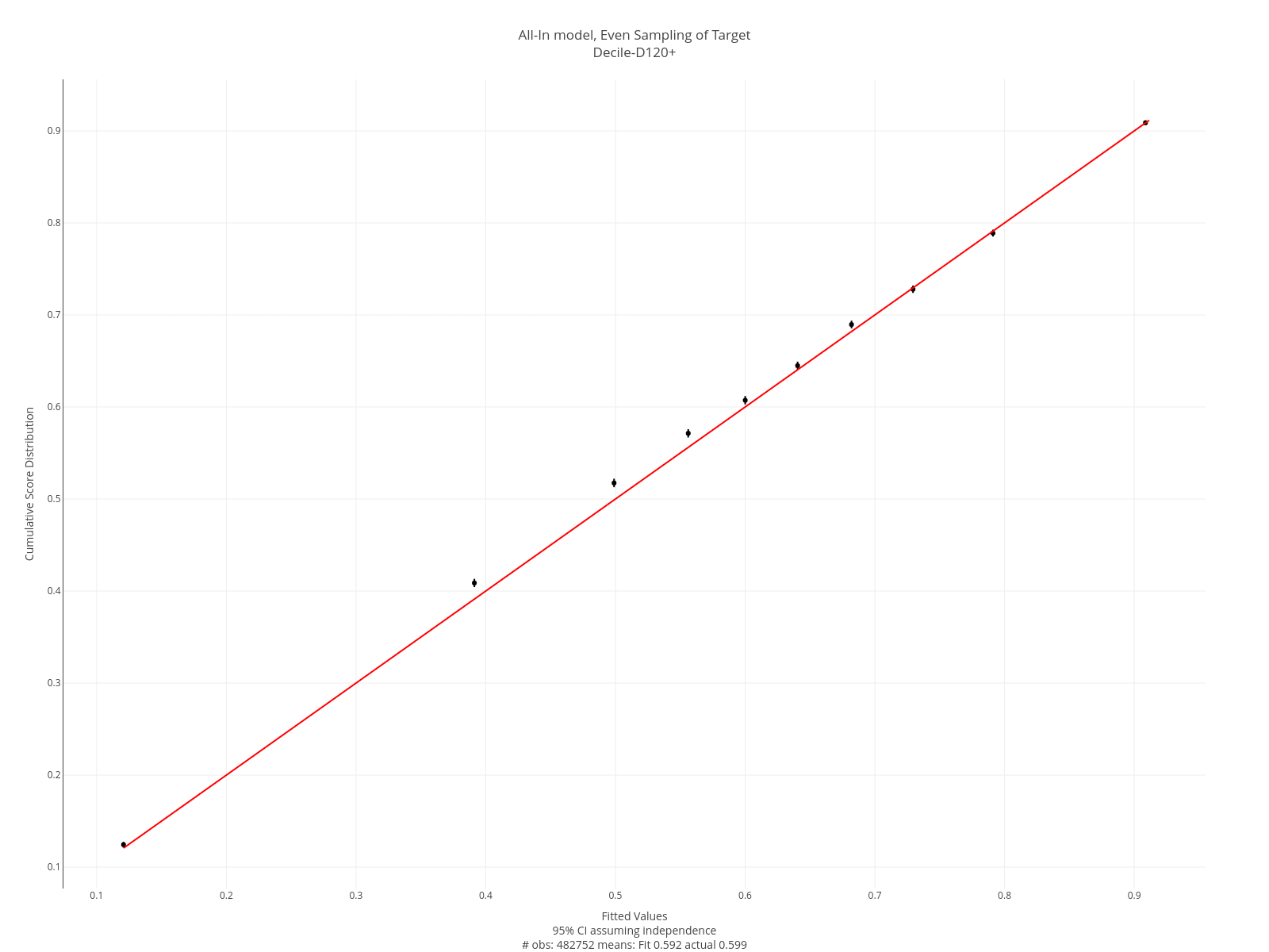
Decile Plots
The plot below is an example of a decile plot. The decile plot is constructed as follows:
- The model output is divided into 10 equal-sized groups.
- The average model and observed values are calculated for each group.
- These are plotted, along with a 95% confidence interval. The interval assumes independence of the observations.
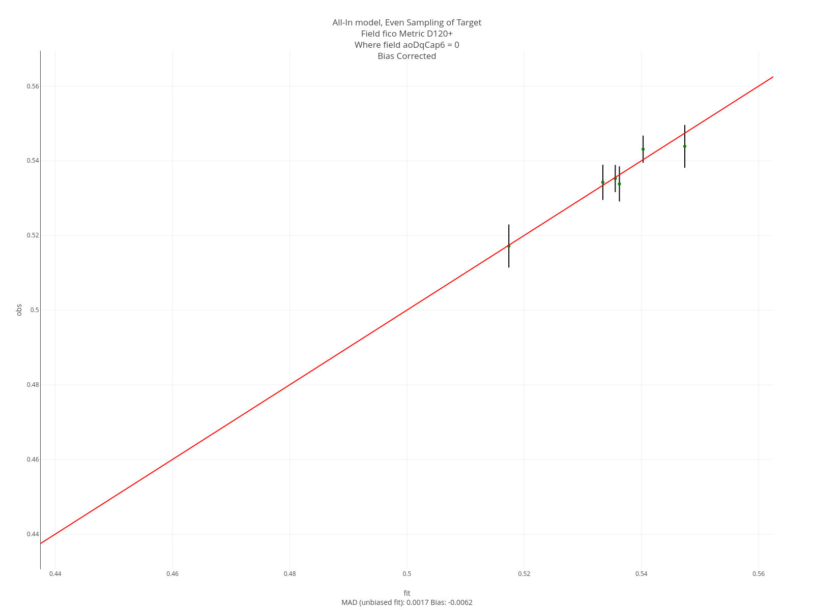
Segment Plots
Segment plots are called that because they involved segmenting on the value of a field of interest. In construction, segment plots are similar to decile plots. However, the process of creating the segments differs. Each point on the plot is based on a level of the field we’re segmenting on.
If the segmenting field is a continuous field, then the segments are formed by the quantiles of its distribution. The groups are formed by: <.1, .1-.25, .25-.5, .5-.75, .75-.9, >.9
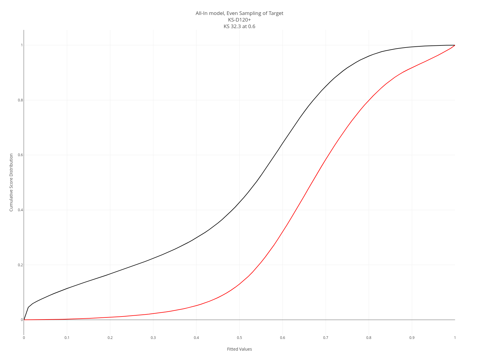
KS Plots
KS plots apply only to models with categorical targets. A KS plot is formed thusly:
- Separate the model output into two groups based on the value of the actual target. So we’ll have a set of model outputs associated with the target=0 and another with the target=1.
- Plot the CDF of the model output for each group.
- The KS is the maximum distance between the two CDFs.
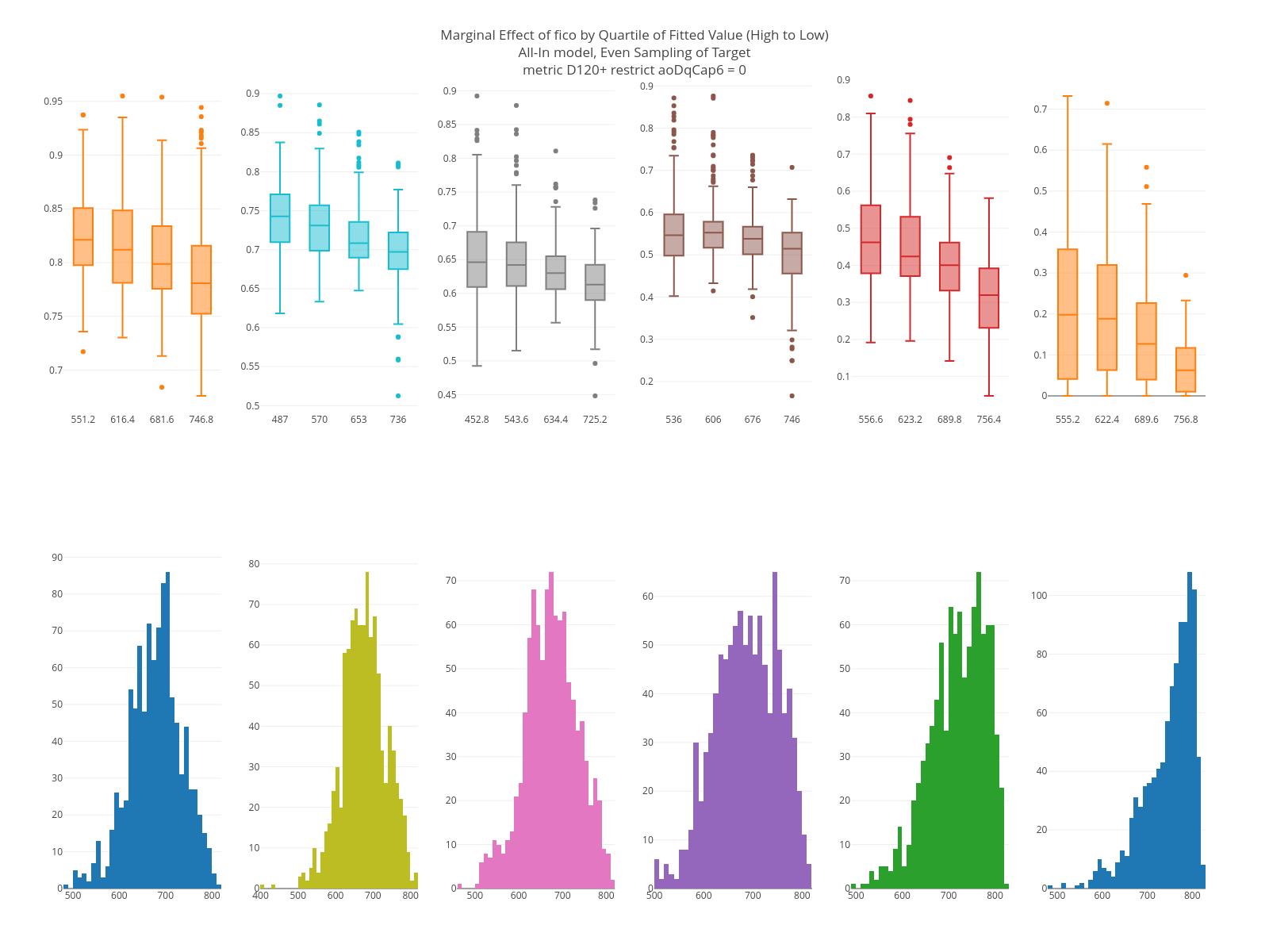
Marginal Plots
The point of the marginal plot is to give an indication of the relationship between a feature and the model output. There are two rows of graphs each with 6 columns.
The six columns are based on segmenting the data based on the quantiles of the model output: > 0.9, .75-.9, .5-.75, .25-.5, .1-.25, < .1. That is, left-to-right the graphs run from high-to-low model output.
The bottom row is the distribution of the feature within the segments. If the feature has a strong main effect, you should notice differences in the distribution.
For each graph on the top row:
- A random sample of rows is taken from the group.
- The target feature of the sample is overwritten with values that range from the 0.1 to 0.9 quantile of the feature, where the quantiles are based on its distribution within the segment. If the feature is categorical, the top 10 values in the segment are used.
- Box plots of the model output are created. If the feature is continuous, the boxplots are formed based on the quartiles of the feature. If it is categorical, then the levels of the feature are used.
In the graph below, you can see as the model output decreases, the distribution of FICO moves higher. Likewise, on the top row, within each graph the higher the FICO the lower the model output.